

Lee Bates
United Kingdom
BA Drawing - Falmouth University. An urban sketcher, a drawer of dinosaurs and imagined creatures.

Lee Bates
added a new topic2yr
I thought I'd share some of my cartoon illustrations I've done. I haven't done too many recently as I haven't had time but I am keen to do more. I hope you like them!
2yr
I'd say slow down and spend longer observing before placing a line. Then ghost the line several times before you draw it. This helps you mentally visualise the line before committing to it. In addition to this, think about what your drawings are for. Are they finished pieces you're going to show an audience or are they a rough sketch in preparation for a more finished piece later down the line? Searching for the right line when you're in the planning stages is perfectly normal.
Maybe a bit of a bizarre choice when it comes to steampunk and machines, but Raphael's drawings are exquisite, particularly his linework. The Head and Hands was the drawing that really showed me how important line was. While Kim Jung Gi is obviously incredible and far more relevant, the economy with which Raphael drew was outstanding. Every single line was important. To contrast Raphael's work, I'd suggest Heinrich Kley. Completely different style of line but so full of character!
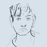
I'd study proportions a bit closer. The forehead is a bit short and the mouth is also a bit short. The eyebrow is also a bit low, there should be more space between the eyelid and eyebrow. Shading is clear and not something I would worry about too much until you have your proportions down. The expression is strong and I like how you've rendered the hair!

3yr
Hi Becca! Thanks for sharing. It looks like you are doing great but I will throw some comments your way so we can all grow together. Currently I feel that more tones could be added to the image as everything seems to be treated the same. To me there seems to be a light, a midtone and a dark. Increasing this to a minimal of 6 or even 9 tones would help out. Some of the hatching seems to be rather straight and seems to flatten the image. Having more of the lines follow the contours of the form would help define the structure.
Lee Bates
2yr
I would argue that having fewer values is actually better. Images with fewer values tend to communicate easier and allow for a quicker read :)
Show all replies (1)
2yr
Try and find variation in lines. Combine straights with curves to create more contrast. My first thought though was that you could try to use fewer lines to communicate the gesture. Using so many lines suggests to me that you could spend longer observing before you draw. Nice work and keep it up!
2yr
Nice work. For the most part, the gesture is clear, however it is clear you don't like drawing feet or hands. Simply suggesting a thumb, a big toe can add a lot of information quite easily.
As others have mentioned, you seem to get distracted by the outline of the form and muscle structure, that's not really the idea of gesture drawing. Other's have also suggested working smaller, but I'd actually suggest working large, A2 or A1 is great. This is because it encourages you to draw with your whole arm, making your gestures more fluid.
Look for bony landmarks too. These include the acromion (the bump on the outside end of the collar bone), the iliac crests (the bony part of your hips either side of your belly button), the sternum, lateral and medial epicondyles of the humerus (either side of the elbow), the medial and lateral malleolus (bones in the ankles). Landmarks such as these will help you create a stronger relationship between the different parts of the body. It also helps having a basic understanding of anatomy.
Finally (and arguably least importantly), is proportion. It's not vital in gesture drawing but it certainly helps. You seem to draw your legs a bit short, they're a lot longer than most people think!
Show all replies (1)
3yr
Great work. The only thing for me is I'd say you could work on a clearer silhouette. There's a lot of overlap which confuses the eye. Fill the whole thing in solid black and see if you can still understand the pose.
Hello. My name is Lee. I am an illustrator from south west uk. I recently gained a degree in Drawing from Falmouth University. I love urban sketching, drawing dinosaurs, human and animal anatomy and drawing from imagination. I use drawing as a tool to learn about the world around me, which in turn helps me visualise strange ideas I have. Here is a little bit of my work. It's fairly varied as I find it very difficult (and limiting) to stick to one thing. Looking forward to becoming a part of this community.
Show all replies (1)