


Joël Gruben
added comment inRecent Figure Drawings - critiques/advice welcomed and appreciated
3yr
Hi Alex!
Fantastic study series you have here, congratulations! I personally used this "three crayon technique" extensively myself and it is a great way to quickly draw lively figure drawings!
I think you know about the proportional errors you made in the studies, so I won't get into them, just compare with your reference material.
I have some suggestions concerning the drawing technique and how to utilize the different colors most effectively. Using your drawings as a reference, I've made a figure study myself using similar colors and a grey background with white to highten the image. Provided, I've drawn it digitally, the principles still apply though:
- I think you're over-using the white for the portions of the figure exposed to direct light. The paper should remain as a baseline for your skin color. The white is only there to highlight the brightest areas of the light side of the figure, not its entirety. In some figure drawings, you are using the white more sparingly but its application is still too inconsistent. The viewer has to quickly understand the form.
- I think you should distinguish the shadow side from the light side more clearly. In some of your studies, it is more clear than others. I think this is also dependent upon your reference material: Clear and strong light sources provide strong, hard shadows which is more preferable for making quick figure drawings.
- I think you're using the sanguine well to highlight warm colors of the flesh. I personally used it in my attached drawing as the main shadow color because of the de-saturated background color (warm-cold-contrast). Just keep in mind that it should be applied consciously to enhance the piece's vibrance.
I hope this helps you with your studies. You can also experiment with different colors and paper colors (warm paper using cold, blue-ish crayons, gold and brown, yellow and violet, red and green etc.).
Happy drawing,
Joël
Show all replies (1)
3yr
Hi Wibly!
I totally agree with Luigi Manese on keeping a keen eye on the structure of your paintings.
I've also made a similar transition from pure lineart to painting. But to this day, I still rely on a well-structured drawing that is underlying my paintings.
Looking at your painting studies, I can see that you are blocking in the greater shapes with sharp brush strokes and then adding in the details once the scene is roughly established. I think it's a great way to study and avoids going into the details prematurely.
But looking at your amazingly clean drawings on your instagram, I would suggest to not entirely abandon drawing in your painting quest.
Drawing and painting are not separate, they work together best. So similarly to your cell shading process:
- First, draw your subject where you are only concerned with the proportions, the anatomy, the perspective, the composition and the flow of the subject matter.
- Secondly, make your underpainting (like your attached paintings) underneath the well structured drawing to establish the color palette and the atmosphere.
-Thirdly, when this sort of "imprimatura" layer is ready, you can start creating the overpainting, working out your edges and details, the lines are slowly disappearing beneath your brush strokes until you arrive at a purely painted image (of course you can also leave some lineart visible if it fits the piece).
This layered process assures, that you are not overwhelmed with having to work out mood, structure, edges and flow in one step, but to slowly build up your forms from skeleton to skin in a reliable manner.
Hope it can help,
Joël
Show all replies (1)
3yr
Hi Mattias!
I really enjoy your classical painting! You can really feel the light finding its way around the figure!
I've done a quick overpainting of your WIP to better demonstrate my suggestions which are along the lines of the other commentators:
- I think your idea was to simplify or "drown" the shadow side of the figure into one shape. That is very akin to comic books (like Hellboy) or the painter Rembrandt (or any representative of "Chiaroscuro"). But I think even with this stylized choice, the figure and its readability would benefit from a little bit of bounce light or "rim light" along the shadow side. I've done that in the overpainting along the jawline, the arm and the sloping back.
- As already suggested, utilize the "sub-surface scattering" to illuminate and vitalize the skin. Otherwise it will look like clay. I've attached a portrait painting by Rembrandt which has a similar feel to your painting. Observe how Rembrandt uses very saturated, deep red colors around the nostrils, the cheeks, lips and chin to make the girl look alive. I've applied these principles to the overpainting.
- Regarding your statement that the light side of the face is overlit: That is more a question of personal taste. You can compare classical paintings by Rembrandt, Van Rubens or Velasques (deep shadows, highly contrasted with bright highlights (see "impasto")) to impressionistic paintings by Van Gogh, John Singer Sargent or Claude Monet (high dynamic range, low contrast, "alla prima"). Personally, I like the bright light as is, but you can make small studies in different styles to see what fits best to you.
- As already mentioned, there are some proportional issues in your painting. I tried my best to fix them but I would suggest to you observe your reference to your image or even overlay them in photoshop to see the proportional misalignments more clearly.
Keep up the great work!
Joël
Show all replies (1)
3yr
Hello Artūras,
I've done a quick overpainting of your amazing portrait drawing to better illustrate my suggestions:
- I fixed a couple of proportional issues within your piece. Compare your original drawing to my overpainting and you will see what I mean:
- The size of the eye you want to focus on in proportion to the rest of the head was a bit too big.
- The snout and the edge of the mouth (which should approx. align vertically with the pupil of the frontal eye) are too far off from the cranium.
- The distance between the eyes was a little bit short for this perspective in my reckoning.
- I think your shading expertise is stunning! Truly great job on that. But I think you could apply details and contrast more sparingly and pull them back where they are not necessarily needed:
- At the moment, there is an even amount of detail level across your whole portrait.
- If you want to put an extra emphasis on the eye as the focal point (which it already is), you could be more suggestive on the neck/ears, distal eye and snout. But on the frontal eye, you can put the most detail and the biggest contrast.
- I've illustrated this point in the attached image with a camera blurr effect and a stronger contrast around the eye. What you can do, is to emulate this camera effect with your pencil work.
But all these suggestions are just minor fixes. Overall, I really love your piece!
Cheers,
Joël
Show all replies (1)

They are all really good I think and I don't have much expertise with portraits, so here i just an idea. In the first three drawing the lines are obvious and if you use them very concious they can be a great style effect. But i think right now you do not control too much where which line shows how clearly. For example in the second drawing one ear is really clearly lined out the other has no lines at all.
And it migth be interesting to try to form all the edges without actual lines as a practice. I think that would take more time though.
But I really like the effect, how you use limited lines. The fourth one is different obviously, I am only referring to the frist three. But the style of this last one is also very appealing!
Joël Gruben
3yr
I totally agree with you Sonja!
I would suggest to you, "portraitsketcher", to look at the superb drawings of John Singer Sargent (see attached images).
He truly figured out how to place strong lines in contrast to rendered shapes to enhance the silhouette of the subject. It is a very stylized approach, but I think you're heading in this exact direction.
Happy drawing!
Show all replies (1)
Show 2 more replies
3yr
Hi toast64,
First of all, I really like the vibe of your drawings and how you made these portrait studies with one consistent style on one page. Great Practice!
Regarding you question, there are only a couple of things for you to consider for your next portraits:
I've done a quick paintover, just compare them to your drawings so you better get what I mean:
- I think you should darken the shadow side of the forms more, so their plasticity is more visible. You've already shaded it a little bit with a dark terminator line, but I think it could use a little bit of a darker tone (as seen in the paintover).
- I think it would be better for you to use a paper with less texture than you used for the studies. The texture is not helping you make clean lines and it also becomes harder for you to render the shadows smoothly without the paper texture being too distracting.
- Some proportions within the faces were a little off. Just compare them to my paintover. Keep a close eye on the proportional relationship between eyes to nosetip, nosetip to chin and distance between eyes.
Good luck in your further studies!
Joël
Show all replies (1)
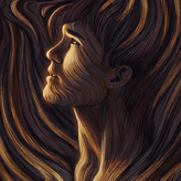
3yr
For being sort of new to digital painting, these look very promising, Christopher! I think you are already advanced in rendering the human form as well as establishing a harmonious color scheme. The area you could still work on a bit is your brush work, or the consistency of your brush work within one piece. You are using different brushes with vastly different texture and softness to them (clothes vs. skin vs. hair/beard). To avoid this disconnect between different materials within a painting, I would suggest you only use one, simple brush within one painting and only vary the flow/hardness/opacity/pressure sensitivity of this one brush to render different materials. Good luck and cheers! :)
Show all replies (1)