


Jeff Reid
added comment inHow to deal with noisy/attention stealing backgrounds in landscape painting?
2yr
James Gurney is an excellent artist to refer to for how to simply complex background. Check out some of his plein air painting videos.
2yr
Take a look at “Knights and Armor “ by A.G. Smith it’s a coloring book for kids but what I like about it is there are line drawings with no tone that depict various types and periods of armor . It’s great for reference to create your own designs. The book is a Dover publication and is available online or ordered from your favorite local bookshop
2yr
Another poster mentioned James Gurney, he painted the Dinotopia books, often made models of the imagined scenes to get the lighting and work out the composition, you may want to try that. There are inexpensive models available to use as reference figures. Children’s action figure toys spray painted grey work great too. You can usually find them at the dollar stores . Pose the figures and light them to create the lighting reference and then use other reference for details as needed.
2yr
It’s very well done. Perhaps some of the design elements around the neck detract from the face a bit and you could play with some variation in the edges to direct the viewer’s focus to what aspect you want to showcase. Some edges may be kept sharp others softened or lost. These are aspects of design though and subject to taste. You may also want to consider head placement on the canvas , is the head to large for the space of could it be better composed.
Two suggestions to improve symmetry 1) use a mirror to look at your work periodically or use your phone to take a snapshot and flip the image. Asymmetric aspect tend to show up when looked at with fresh eyes as with a mirror. 2) learn about and apply Reilly rhythms to the face they really help with getting the features to align properly, Bradwynn Jones does some excellent examples of how to apply the rhythm lines.
Show all replies (1)
Hello everyone, I’m a hobby artist I’m on Instagram @JEFF_REID_ART below are some recent works
2yr
I am an oil painter too. I also enjoy other mediums such as charcoal and graphite
Show all replies (1)
2yr
An excellent tool to help working from either a live reference or a photo is a knitting needle or proportional dividers. You use them to measure a reference point like the distance from the side of the head to the tear duct of an eye, make a mark at each point and use that as a reference to judge other points on the face. This is in reference to a portrait but the same applies for figure drawing. Once you learn proportional measurement the next aspect I’d suggest it to pay attention to the angles of lines connecting the reference marks you make from your measurements, then look at the negative spaces and the shapes they make, compare to your reference. Now think of the anatomy and the rhythms of the forms. This should help you build a solid image from reference.
I’d echo Jan D’s comments and add that if you want to blend and glaze oils are easier to work with, if you want to work in layers and quickly add new layers acrylics are advantageous. Fantastic work is possible in either medium . I’m my view oil allows a more laid back relaxed approach. I like to do an under painting in acrylics because it’s fast drying and then finish with
oils. Remember oils can go over dried acrylics but not the other way around , never acrylics over oils.
I think there is an opportunity to increase the atmosphere perspective and sense of depth by lightening the mountains in the background, color shift them blue as the green wavelength is lost at that distance. Also soften the edges in the background. The figure in the foreground is the focus and should draw the attention. Consider increasing the saturation and contrast in the figures.
Show all replies (1)
I think they are very good alla prima studies. I’m not sure what you want to work on. One thought is that you could work on edge variation, most of the edges I see in your examples are consistently similar some edges should be sharp, some soft, some lost. This may add interest to your work, allow you to emphasize areas , and add a technical challenge which you’ll find engaging.
2yr
Suggest Cesar Santos and Andrew Tischler for excellent examples of artists that bring portraits to a high level of finish. Both have hours of free videos on YouTube and excellent extensive video workshops available for sale which you can watch over and over.
2yr
I think they are good sketches . You may have answered your question, if you put a couple of hours into alla prima studies you can only expect a certain level of finish and detail. I suggest you try indirect painting. Try a charcoal drawing to get the proportions the way you want, work with line, planes and rhythms, avoid values. Transfer the drawing to your painting surface. Then do a wash with a fast drying color like umber, one color wiping out the lights with a cloth. Let that dry, then do a grisaille , monochrome painting, go one step lighter overall than your reference. Get all the values and shapes just the way you want. Once the grisaille is done you can leave it or add color with glazes and scumble on some lights adding a bit of impasto in the lights for emphasis. This is a slow process and you have time to evaluate at each stage. Bring each stage to its own level of finish.
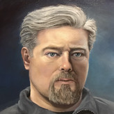
I like the portrait. You may want to look at the values. Try converting the painting and the reference into grayscale. The white of the eyes for example looks to be too bright which can flatten the image. The same for the shadows in general. The transitions are a bit sharp in areas too, check your edges add variation in the way you handle edges, some should be sharp, some soft.
2yr
I like the portrait. I think there is an opportunity to deepen the shadows on the face. The value difference in the garment is greater than in the face, you may have been reluctant to lose details in the shadows but having some lost edges can enhance the composition. Also the lights are a bit washed out, you may want to look at increasing saturation when raising the value, this can be done by adding in high chroma colors into your light mixes. Save the low chroma high value notes for the specular highlights.
To increase the sense of depth through atmospheric perspective I suggest reducing the saturation and compress the value range in areas that you want to recede. In general, your highest areas of contrast (darkest darks and lightest lights) and most saturated colors should be in the foreground. You have similar values and colors used
Self portrait ,11x14” oil on canvas . Jeff Reid CT USA