


@esthermaxwellfineart
2yr
Asked for help
Hi- any pointers or advice on how to improve my drawing skills would be a god-send :) This 9 by 12 drawing took me 6 hours.
Thank you in advance for helping me get better at my art :)
added a new topic
Bargue Plater2yr
Hi- I'm new at Bargue plates and was hoping for your feedback. I know my layin is messy- any other tips or advice that you can share? It would mean the world to me
Thanks in advnace


@esthermaxwellfineart
Hey, Esther!
I agree with our fellows below, great work on this portrait! The likeness looks indeed pretty good in both paintings, especially considering all you had was a poor-quality photo to work from. The slight underdevelopment of the ear structure doesn’t bother me, I feel as if it’s part of a compositional choice. I love the brushwork and color design overall.
To my personal taste, I prefer the values of the first painting. I feel like the global contrast in the second one is not as strong (or at least it seems so, based on this image you posted; If you painted it traditionally and took a photo, maybe it looks fine in the original and it could be just a matter of compensating the levels digitally after photographing). Also, as much as I love the brush textures in the second painting, I really like the simplicity and the cleaner look on the first one - so, yeah, I guess if I had to pick one, I’d personally go with the first.
In terms of suggestions for what to adjust, I have a sense that, in both paintings, his left eye (the one to the right of the images) is slightly off compared to what the structure of the head should allow: in the first painting, to me it looks a bit too much downward, and in the second one, a bit too much inward. My thought is that the first one is less of an issue because the expression of his brow could be lowering the lid thus causing the impression of pushing the eye downward. Anyway, plumb lines, cross-contours or a method such as Reilly could definitely help checking this kind of thing in early construction stages.
About working with low-quality reference for this kind of art (portraiture, which requires likeness and attention to detail), honestly what I’d say is “avoid” 😅 Of course, ideally, it’s always better to work with higher resolution reference, but I know we don’t always get a choice… Perhaps one idea, in this case, would be to ask your client to provide more photos of the subject you’ll be painting - even if the other photos are in different angles or lighting situations, using them as a side tool can help you get a more solid “big picture” of the particular features of that person you’ll paint. Actually, I think using more than one reference can be helpful even if the main photo has better resolution. Sometimes, the likeness of a person goes beyond what one single photo can show, so, as odd as it sounds, having additional references to change things and design your painting as you feel works best can be the way to go for portraying someone (instead of sticking to one image of them and trying to paint it as closely as possible).
Hope this helps!
Keep up the good work.
Cheers!
@esthermaxwellfineart
2yr
Thank you for taking the time to write this comprehensive answer- its been very helpful :)
Show all replies (1)


Well I don't know what those artist think,but I can assure you if it get you where you want and result is good,it's probably real art.
(Beside erik gist does the same thing and Erik Gist is one of the best artist in recent times)
I'm guessing think that kinda thinking reside to people who does more life painting and alla prima.If you're an illustrator or comic book painter,this kinda process is basically mandatory considering you need to establish complex shapes from your head on canvas
(Also example of erik gist piece I was talking about https://www.instagram.com/p/B-2I_ollukn/?utm_medium=copy_link)
brilliant- thank you so much for sharing. I have direction now for where I need to improve my work as well as clarity on the technique in question. I really appreciate you taking the time to give me this feedback :)
Show 2 more replies
added a new topic
Painting Technique- I would love your feedback!2yr
Hi- I recently started a new technique for painting whereby I draw a detailed line drawing with shadow shapes and edges. I then paint it in a systematic way using small tiles of color to get me to the finished result. I have heard other artists describe this as "the worst way to paint" and "not real art". I would really appreciate your feedback on why this technique is so frowned upon
Below is a link to a timelapsed video of me using this technique
https://www.instagram.com/p/CZZaRq4AnHg/
Pretty good,I can see you improve from your last painting,your awareness of warm and cool is better.
The second painting is better so I assume you paint it at the latter?(I particulary like the use of more soft edge,also like the visible thin brushtroke on the man shirt which create a nice interest,unlike the first which only is very plain)Though I will say even though the 2nd one I feel is better, the first one I has a more dynamic feel to the beard(as in the brushstroke felt more effortless on that part) also the face has a more reddish tone which I enjoy (but thats more subjective)
If I have to give critism I would advise you study more of the structure of the ear(as though it is not bad,I feel you can do a lot better.)I advise copying the drawing of John Vanderpoel,as he was great with designing the human feature.I would also advise making the area of the hair touching the face more softer as this would give less attention to it and more on the eye.Alongside this I would also parrot what John Carter said and make the value of the background closer to the black shirt.
(Example of painting with softer hair and clothes with closer value to the background ,both by Solomon J solomon)
Well I'm sorry if that was too long,hopefully it was atleast useful
Thank you so much- I love that you made this critique long! I especially appreciate adding the visuals too. This has been very helpful :)
Account deleted
2yr
Wow, really nice likeness! The value of the shirt pulls my attention maybe a bit too much. Although your tones are very faithful to the reference it’s up to us as artists and designers to change things as we see fit. You may want to rethink your value plan for this portrait to guide the viewer’s eye? Maybe not. It’s your decision to make :-)
But altogether this (the 2nd one) is a very nicely done portrait. Would love to see more.
added a new topic
Portrait Painting- I would love your feedback!2yr
Hi everyone
I was recently commissioned to paint two portraits of this very pixleated photo of a rabbi. I tried to do my best but I was hoping you would let me know where I can improve my portrait paintings in the future. Also, if you have any tips on working from pixleated photos please let me know those as well
Thank you in advance!
Esther

Likeness is great. Look into cool colours for the shadows. Bottom could have a little bit more work on the form so it looks like you're more angled. Super tempting to add reflections to the eyes, because they look great, but your likeness is so strong I think it distracts from the face (this is subjective though). I did a quick paintover to show you what I mean.
Colours
https://www.youtube.com/watch?v=9YMPI3Dg6i4&ab_channel=BenLustenhouwer
Also you're amazing and tell me to bugger off if you think im being rude.
Thank you for taking the time to touch up the painting. It really helped me see the points you are making.
I like the kinda scratchy crosshatching of the clothes and hair,I also like the shape design on the nose and the cast shadow below it.Alongside what John CArter said,I would also advise that you make the halftone of the face lighter.For example here's a John singer sargent drawing where he make the halftone lighter to create a nice light and dark composition.

Looks great tbh!:) Maybe you could try to blend some edges a little just to try it out. introduce some softer edges? Great 3d feel to it!:)job on describing the form!:)
That is something I struggle with- thank you for pointing it out- I'll try to address it
Your brushtrokes on the hair is pretty good,remind me a bit of sargent and zorn.If I have to give a critique,I think you made the skin tone too warm (and I'm saying that because your shadow and light feel like they have the same temperature to them.)I advise making the light cooler.
I also think you put too much indication on the shoulder blade,i think you stick too much to the reference.Like here's an example of John singer sargent,you can still see the shoulder blade,but it's very indicative.(also now that I look at it,it's a good example of cool light and warm shadow)
But other than that,keep going,I'm sure the next one will be better
I see that now- I wasnt even thinking of making the lights cooler- this was really helpful :) Thank you!
Account deleted
2yr
Hi, Wow -- very nice! My only critique (and this is a matter of taste) would be to add some dark shadow occlusion accents. But really, very good work.
BTW - the video link seems to be to a painting process vid and not the pencil drawing :-)
Cheers!
Thank you so much for taking the time to reply :)
Would you mind elaborating where occlusion shadows would be appropriate on a portrait?
The link I SHOULD have put down was https://www.instagram.com/p/CZKfRzrAuzF/
Show all replies (2)
added a new topic
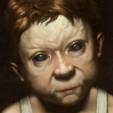
Portrait Drawing- I would love your feedback!2yr
Hi-I'm a student artist and would sincerely love any direction you can give me on where my art needs improvement. Thank you in advance!
8.5 by 11- 2-3 hours
PS If you'd like, i made a video of my process for you to watch
https://www.instagram.com/p/CZMczt3gYHA/
added a new topic
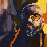
Portrait Painting- I would love your feedback!2yr
I'm sincerely looking for direction on where I can improve my skills. Any help would be greatly appreciated
11 by 14 oil painting, 4 hours
PS If youd like to see the complete painting process follow the link below
https://www.instagram.com/p/CZMczt3gYHA/