


Tim Dosé
added comment inDigital hobbit painting. Need help
3yr
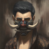
What stands out to me the most is the composition, which is confusing. It's really hard to understand what's happening in the overall picture. I'm able to piece it together since I know the story—we're looking out of Bilbo's burrow through the round door. But if I didn't know that ahead of time, I'd be really confused about what's going on. Am I looking through some kind of telescope or manhole or something? What is the round red thing next to it? I wouldn't assume it's a door since doors are usually rectangles.
A few questions to ask yourself:
- If you were the viewer, what would you need to see to understand what's happening in this picture?
- Why did you crop the picture the way you did? In particular, the bottom.
- Is there a better cropping that would explain better to the viewer what's happening?
- Are there details you could add that could clarify to the viewer what they're looking at? For example, what would make it clear that the round thing is a door?


Alexandre Morais
3yr
Thanks! I'll keep an eye on these details

3yr
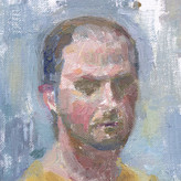
Hi there! I think you are doing alright, the value on the figure feels a bit soft, so it might be a good idea if you could map out the lit/shaded areas on that figure and apply value/colour accordingly. To me the "not enough separation between lit and shaded area" is the main concern here.
As of details... I think it's often simpler if you have a very pronounced value contrast in the big shapes first. Then you can go to like the door texture (it must be make of some slices of wood? and also imperfections along the edges, that fence, texture on the grassland, clip and sewing patterns on the backpack?
added a new topic
Digital hobbit painting. Need help3yr
Hi. I've been learning a lot about light and color recently, so im trying to apply on this little ilustration. I think i've reached my limit and the only things I can keep refining are the shapes and edges. Though I still feel that something is missing. I would love some help :D


Hi Tiffanie! I never painted with traditional media before and I’m Just starting out with gouache, I usually paint digitally! do you have any tips or exercises suggestion to understand this medium better?
3yr
Humm... you are doing much better than when I first touch colour.
I think the brightness/value should be your main concern here. Looking at the painting here, it's like the colours are likely "washed", or like very close in brightness. If you compare that leyendecker one, your green seems too light and the white seems too dark.
The HSV colour picker is not a constant-brightness one, which means if you dial the hue, the brightness would change. You could probably use HSL/HSI' picker and you can see much more clearly why you need to keep your brightness in check.
A way to keep yourself sensitive to the full value range is you could paint a pure white and pure black in adjacent somewhere on your screen so you could immediately see the range you are working on, so it's less likely to fall into the "ok I think this is dark/light enough" trap.
3yr
Ahh thanks! I've seen your work, I hope I can get to your level :D I've already changed my color picker. I'll try this last tip now, thanks again!
added a new topic
color noob3yr
These are some random color studies i've been doing. I'm trying to mostly use a hard brush but i'm struggling a lot. I would appreciate some feedback or tips :D

3yr
Its kinda fading in to the background, I would try to push the darks to
Silhouette the figure better. Otherwise its pretty good. :)


3yr
Yeah as soon as I saw it I immediately thought of Zapata's drawings. I'm a beginner so I don't really have anything critical to say other than the fact this looks really cool!


3yr
i really love the vibe of this drawing i hope you continue on your art journey because you already got great potential :)

3yr
Try to make the shadows darker so you have a clear separation between shadow and light, and also by doing that you'll have more value range available in the lights to render forms in halftone. Steven Zapata always says that you can always make the shadows darker! in pencil we tend to think we've already gone dark enough but you can almost always push it more.
3yr
Thanks for the tip!! ^^ I actually tried to make the shadows as dark as possible without pressing too hard on the paper. I guess I should have used a darker pencil.
added a new topic
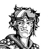
Demon dude drawing3yr
I got hugely inspired by Steven zapata's work recently, so I decided to make a drawing like one of his. I guess that's the first time I make a long pencil drawing like that. Any thoughts or feedback? I still gotta figure out how to make the background more clear. And I think I should have pushed the pose more to get a feeling that he is leaning on the "pillar". Anyways, that was really fun to make.

3yr
Hi @Alexandre Morais I think your assessment is spot on, which is a really good sign that you're aware of what's going on in your work! Luckily through photoshop, its pretty easy to just add a multiply layer on top of your drawing and lay in those darker shadows. I think you're also going to have to lighten that foreground just a tad bit so that your shadows can read more clearly.
Additionally, you want to think about just some light indication of material rendering so that you can differentiate between the objects in your image. Right now, the goblin skin, wooden shield, metal helmet, chain, and fabric all seem like they were rendered very similarly. You'll want to keep in mind the reflectivity of these materials, and how that presents itself in your rendering. The value of metal for example is highly dependent on the light sources around it. Since the scene is mostly very dark, the local value of the metal should be very dark as well. You'd get pops of light in the metal from the light coming off screen, and that light should be way brighter than the light that hits the skin.
There's definitely a lot of things that need to be juggled when you take on a more finished character illustration like this, and I think you did a pretty good job! Let me know if there is anything about my critique that I can clear up for you
3yr
Yeah, i gotta make some material studies bc, I had almost no clue on how to make the textures. Thanks for the feedback!


3yr
Cool little goblin guy. Push those values! If you are having trouble with saturation and contrast, try starting with all flat colors and make sure those are at the saturation you want. Then you can add in hard cast shadows with a blue or purple (or whatever color you want, just not gray) on a multiply layer. This gives you a nice base to start painting on top of.

3yr
You captured that old school feeling, I like it! His weight is centered a little too far behind his feet, so he doesn't quite look balanced. And I'm not sure how he's wearing those bracelets, looks like they might fall off, if he lowered his arm down, and his helmet may be cutting into his ears. If these are intentional, it's fine but otherwise, it's a good idea to think about function when sketching. Also the shield could use a bit of thickness, it looks paper thin.
Values look maybe a little low contrast, but I think that adds to the old school look. Otherwise, the style looks consistent. If you wanted to make shadows darker, lights lighter, you could certainly do that. Depends on what sort of feel you want. You can always try on a new layer and see how you like it, or just try it on your next piece. Keep on sketching!
3yr
yeah I noticed these things too. I guess I gotta pay more attention when sketching. I also liked the "old school" feeling but it was accidental... Actually most of my paintings are coming out too low on saturation, but im trying to work on that now. Thanks for the feedback


3yr
Main thing I see is the positioning of the sword is really weird. Should be more upright if he's just standing there. The other thing is that the legs are in the same position, which makes it less interesting. The shield looks brand new, when it could be an opportunity for storytelling: battle scars, chips, pieces missing, etc.
3yr
I think you could use a bit more "lean back" for the left leg, but otherwise it looks okay to me. You can take liberty for some proportions.
If you want the image to look less "stiff", you could try introduce some irregularities on the illuminated shapes. If you look at the knee and the shoulder, or any "connecting" parts, the muscle actually forms some interesting shapes there, so it breaks the "big geometric" shapes at those positions. that way it's more dynamic, and you'll have big/small detail contrast.
added a new topic
goblin from imagination3yr
I guess that's the first time I've tried to put color on a longer drawing from imagination. I think I made the shadows too light. What do u think? how can I improve my lightning and lines?


3yr
nice study! The feet look a bit too small and the pose is just a bit too stiff. Maybe try to sketch it out as a gesture and see if you can find a more flowing feeling in the pose.
3yr
I actually started with a gesture drawing, but I guess I stiffened a little bit while painting xD Thanks man


3yr
Hey there! Great work so far, I love the cleanness.
I should work on your shadows a bit more. The skin tends to be darker in general. If you check out the reference, you can see that the darkest parts of the skin, are almost the same darkness as the lighter parts of the hair. So in general you can afford to make the shadows much darker.
Keep up the good work! :)
3yr
Yeah, I felt that she was too light as well. I think I get a little lost with the reflected lights
Show all replies (1)