

Dario Mekler
Buenos Aires, Argentina
Illustration artist and graphic designer

Dario Mekler
added comment inHelp fixing painting appreciated
3yr
I think the level of rendering and your technique work in general. The problem is in the composition, the disposition of shapes, It needs more variation: Different sizes and angles for the heads. Different levels of detail and contrast. For example, you could soften the water´s edge to lighten the contrast between it and the background.
Show all replies (1)
3yr
The drawings are very good anatomically and proportionally. I might add one more thing (I already see a couple of good advice comments) If you want to avoid the stylised look you shouldnt make the line the principal source of contrast. Yuo can still use the contour line but try to build the sharper contrasts in the mass shadows of the face for example. In the horse drawing I see the contour line being darker than the patches of shadow in the body and that flattens the drawing.
Show all replies (1)
3yr
The shapes and the character design are really interesting, moreso if you didnt use a reference. I dont see problems with the color scheme. What you really should check out is the relationship of contrast. I would say that is the case 90% of the time when a composition isnt working. Leave your main contrast for your center of interest (I would guess her face, and secondary her hands) and then design a hierarchy of diminishing contrasts for the rest of the details. I attach an untidy overpainting, but hope it illustrates my point. Hope this helps.
Show all replies (1)


3yr
I've been trying to figure out how to study composition and how to teach it in my classes. It's a tough one because it is so subjective. I don't want to tell my students that there are 'right' and 'wrong' ways to compose an image.
I like to start with a goal then work backwards. What does mastery of composition look like? What can an artist do when they've mastered composition that they could not do without that knowledge and skills? Unfortunately I don't have an answer for those questions yet. I still have much research and thinking to do.
What I have been doing is taking a logical approach and trying to come up with a mental framework for understanding composition. The first step is defining composition. I've defined it as: "The arrangement of visual elements of art in order to communicate in a clear and satisfying way." The next question that follows logically from that is 'what are the elements of visual art.' For that I'm using line, shape, value, color and proportion. How can I arrange them in order to communicate in a clear and satisfying way? Clarity and satisfaction are both very subjective, so there is no easy answer there. What are my options for how to arrange them? They are pretty much infinite so I need some sort of principles or categories to organize how to organize them. Based on my research and thinking on the subject, I've come up with the principles of emphasis, contrast vs harmony, repetition, rhythm, balance, and unity. Now I can look at how each element can be arranged by each principle. I did this a couple months ago and wrote out this whole logical framework. It's about 40 pages with small illustrations to test out each point. I think it's helped me but its just the beginning. I need to understand how to put it into practice to make my art better and how to teach it in a way my students can apply it. I'd be happy to share this writing with anybody who's interested. I'd love to hear other peoples thoughts on this idea.
Dario Mekler
3yr
As I see it, composition is not that subjective. For example the principle of contrast is pretty much universal. We evolved to perceive it. The greater part of humanity will know where to look at if they see a black dot in a white piece of paper. You can control that. Contrast of shapes and sizes works in the same way.
Show all replies (4)
3yr
This is a great effort. You surely seem motivated. Gesture is something difficult to grasp without some fundamentals of the body first. In my opinion you should focus first in the relationship between the torso and the hip bone. The so called "bean". You have some proko videos refering to this concept. Leave the extremities aside for this task, at least until you feel comfortable with just the core of the body : https://www.youtube.com/watch?v=yqxPHew5bGQ hope it helps.
Show all replies (2)
3yr
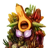
Some Illustrations done in graphite pencil and digital colorization.
Cuzco - Lobster Siren- Systems of the World
3yr
Congrats, Its a really cool design. But I would say most of the details you carefully added in there are kind of lost due to low contrast. Its really difficult to appreciate them. I think you should add some lighter patches of tone in there so as to give the eye something to hold on. Some middle values to contrast with the darker ones.
Show all replies (1)

3yr
Asked for help
Hi Jon and hi everyone, totally excited about this art community thing. I really struggle with color, value and rendering to a specific level. Any advice, Tipp, Tutorial or whatever are totally welcome, please help, kiss kiss and much love!
3yr
You should pay attention not to the values in itself but to the relationship between them. This is called Contrast. An image is a map of contrasts where each shape has an asigned value. The eye of the seer will go where the sharper contrasts are first and then notice the softer ones in declining order. In narrative imagemaking the rule is that the main contrast should be in the center of narration because thats where the eye will go first. In the coffeemaker illustration your main contrast should be in her hands preparing the machine, no other contrast should overpower that one. In the second image your main contrast should be wherever you want to center attention. My guess would be his face, but it could also be his shirt for example. It depends on your intention.
Edit: I added the overpainted image. I softened contrasts in the whole image and enhanced the relation between her face, the border of her shirt and the coffee.
Show all replies (2)
Show 15 more replies
3yr
The reason leaves are guiding away from the beatle is because of contrast. Eyes tend to follow naturally the sharper contrasts first. In this image the dark tone of the leaves creates an extreme contrast with the light tone of the paper. On the contrary the light tone of the beetle creates a softer contrast agains the tone of the paper. To solve this you could make the surrounding space to the beetle darker so the yellow pops up more. Or you could soften the tone of the leaves so it resembles the one of the background. Hope it helps.
Show all replies (1)
Every image is made of abstract bidimentional shapes in its essence. Referential images are made of abstract shapes that happen to be similar to things we know from the world. What you should look for in a composition is rhytm in the distribution of shapes and contrasts. Use a wide variety of contrasts (hard and soft) and look for varying shapes. Remember this: Repetition of shapes tends to form patterns and patterns are predictable so always look for different shapes. Hope this helps in some way.
3yr
This one is really cool. It is very well done. One thing only: Be careful with the contrasting lines in the contour. That level of black against a light tone draws your eyes away from the details from the muscles. Thats a shame because they are so subtle and well rendered.
3yr
The drawing is pretty good. Proportions look correct. To bring it up a notch you should add the darkest of values somewhere in there. The dark black in the signature should be in the drawing too so as to make the range of tones wider and more varied.
3yr
The proportion in general is pretty good. What you are missing are some dark values. Look how dark the brush and the place between the thumb and the index finger look in the photo. In you drawing there is a general grey with small variations while in the photo the range of variation is wider. The key word is contrast.
Show all replies (1)