

Alberto Grubessi
Italy
Hi i'm Alberto, illustrator based in Italy. Nice to meet you all :D

Alberto Grubessi
added a new topic2yr
Hi guys, it's been a while since i posted here. I'm doing these illustrations for a portfolio for illustration in novels and i would like some critique on it. Please tell me in your opinion what could be better. The novel is "The masque of Red Death" by Edgar Allan Poe. P.S. some illustrations have a box on the side but this will be removed in the finalized version
The idea of the first drawing is very good, but is completely flat, i think you have chosen a very difficoult scene to draw. In my opinion, you should restart the drawing completely, simplify the composition, make a perspective grid and then you can worry about the style. It will take a bit of time but the final result will be better
Show all replies (1)


Asked for help
Hello I made this cover,based on the Natsuo Kirino's book,real world.Would love some critism of what's not working(also would like to know if the font's too small)
Alberto Grubessi
2yr
I think the composition works but the font is really too small
Show all replies (12)
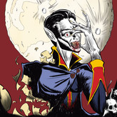
This is my submission for this month challenge, I've decided to illustrate Bram Stoker's Dracula and i designed the illustration to give a horror feel but also keep the character of Dracula mysterious like it is described in the book. I've also added some elements in the bottom part of the illustration to give some clues to what type of book is ahead. I've used only 3 colors: red, yellow and some blue. Let me know what you think.
Show all replies (2)
it helps to know exactly what you are going to do the day before, for example on monday night i know that on tuesday morning i have to finish my personal illustration or to practice perspective etc. ,My routine is wake up at 6:00 am, get coffee, and then start to work, some warm ups like 3-5 minutes and then i start my practice or whatever i need to do. Hope it helps
3yr
Hi everyone, my name is Alberto i'm almost 23 and i want to became an illustrator, right now i'm studying by myself and 'ive improved a lot just with practice and studying but i want to improve more so that i can reach my goal and your help would be awesome. I would like you to point out the 3 major problems that you see in my work and how can i improve it, thanks a lot for the opportunity :D
3yr
https://www.youtube.com/watch?v=amlwcI8dh_g&list=WL&index=14 ; i recommend you to watch this video i think it could really help with your problem. At least it really helped me not to focus about style, hope it helps you too
Hi alex, i am doing this curriculum too!! i am currently at stage 4 and i think it's very useful, my art is improved a lot since i started. I would like to give you some advices that i discovered while doing the curriculum:
1) as Karim said, take your time doing the challenges and the section, i found that in the first part of the curriculum i rushed a bit and maybe my results would be better if i didn't rushed. For this reason i feel like i should go back and at least re-watch/read the materials.
2) i think it's important to check out all of the material suggested (not necessarily buying it) because i found that some of the materials ,for me, were not stimulating or efficient. Example, i found scott robertson's book extremely tiring, boring and excessive; i want to be an illustrator so i couldn't care less about product design and doing very precise and calculated drawings; on the opposite side i found the drawabox curriculum extremely helpful even if i didn't submit for critique, because the program is more direct and applicable immediately on your drawings.
3) during your challenges i would advise you to submit examples of your work to critique, that's because doing this at the end it's too late and so doing it at the middle or dividing the work in quarters can help you learn your mistakes and immediately applying what you learned on the next session.
4) i am also working about 2 h per day because i'm currently at university and i have to study for my exams, don't expect this process to be fast, the curriculum says about 30 days and i said "sweet, 2 years and i have all the foundamentals laid out!!!" well i started a year ago and i am only at stage 4 XD. Although this may seem frustrating we have to accept that we can only study for this much time, so peace yourself and enjoy the process, i can guarantee that if you stick to your plan and really draw 2h a day everyday (or so) you will see progress.
Hope it helped, i am sorry if some of the advices may seem silly but i found out these things and so i thought it may help.
Show all replies (1)


3yr
These are looking great overall and are great fundamental practice! It's awesome seeing you limit your values so the subjects clearly stand out as light shapes against the dark background, that goes a long way towards clarity in finished pieces.
Two small suggestions:
1) Some of your form edges are a bit too hard. Remember shadows happen as planes turn away from the light, so a form with sharp plane changes (like a cube) will have hard edged shadows, but a form where the planes gradually turn away from the light source (like a sphere) will have softer edged shadows. You're doing this on some of these, but there's a lot of spheres and softer forms in these with hard-edged core shadows that should be soft.
2) Watch out for your reflected lights becoming too bright. In most of these the reflected light is getting close to the value of the midtones, which starts to break apart the shadow shape and hurt the illusion of form. There are situations where this can happen, but in most cases it's best to be sure that *all* the values on the shadow side are darker than any of the values on the light side.
Overall fantastic studies, keep up the good work! :D
3yr
thank you so much, i will keep your advice in mind while i continue doing studies
added a new topic
Black and white studies,need critique3yr
Hi guys, recently i'm doing some black and white studies but it's my first time so i don't know if i'm going in the right direction and some critique would be useful. Thanks
added a new topic
critique for a illustration3yr
hi guys, i'm doing a illustration and i would like to hear your thoughts about the anatomy and gesture of my work so far (ignore the missing arms), thanks
added a new topic
gesture and costruction of the body critique3yr
hey guys, i'm back from exams season in university so i have more time to dedicate to drawing. I'm currently doing 100 sketches of interacting characters, so i choose a couple of my best ones and i would like to hear your thoughts about it. specifically i'm interested in critique in gesture and costruction of the body. P.S. these are not finished work but sketches to study
Account deleted
3yr
Asked for help
I did this kind of exercises with one of my drawings, but I don't know if I'm doing it well...
3yr
this kind of exercise is fantastic but i would suggest to use reference photos intead of your drawings, because your drawing could have some mistakes in terms of anatomy and also if you use photos of models you can train your eyes to see reference points on the body
Show 4 more replies

3yr
Hi there! cool paintings!
I suggest taking one of your drawing and breaking it into categories of fundamentals.
For example - your second picture
what fundamentals does it rely on?
There is a character and a background
A character can be described with:
- Character design (shapes, style, exaggeration)
- Gesture
- Anatomy / construction
- Clothes
- Render (Materials, color and light) + style
Background:
- composition
- perspective
- Architecture design
and probably more..
There are plenty of things we can explore in these paintings and we can study each of them separately
what I like to do before diving into a new painting is breaking it down in the same way and then think what are my weaknesses and what should I study first. Maybe I'll prefer dedicating my time only for one category like construction (I recommend Peter Han - Dynamic sketching course and Drawbox for construction, also Fun with pencil by Andrew Loomis)
For example:
if I have a painting with clouds, sea and a creature, I like to separate my time and study clouds, color and light, sea and waves , creature anatomy and the animals they are based on. You can study from photos, masters and other resources.
This way I know for sure that my results will be a lot better after doing these studies and that I improve no matter what.
I hope it's helpful
3yr
Thank you very much for your comment, i will keep this in mind because i think this is the best way to approach an illustration. However i want to point out that the second image was for one of the past proko challenge so my time was limited and i didn't have the time to do proper studies, that said i think that for the future i will focus on characters and so i definitely will work on the fundamentals for drawing a belivievable character
Hi everyone this is my entry for this month proko challenge with the theme of "movie poster of your life", i decided with the concept of a normal guy which is catapulted in his dream world: the comics world. But this isn't the dream world that he wanted because he needs to be the hero of the story and so he gets beaten up because he's not a hero but just a normal guy. Hope you like it☺ also if you want feel free to critique.
Show all replies (1)

3yr
Good work Alberto, colour theory wise I think first look into balancing neutrals with saturated colours.
Aside what Steve mentioned there are some small issues like the sword in the yellow guy going back in perspective but sticking into the side of his arm.
Other little critiques I can see:
Keep in mind the composition. The first image has a lot of trees neatly in a row, which leads the eye away from the main characters. Break them up a bit more with randomness and de-saturate the bushes a little to give more attention to the characters.
For the second one, take note of lighting, the sun is behind her yet she is brightly lit in front and her shadow goes to the left. I would remove the sun and just have the sky brightly lit as on a sunny day.
The skull looks great, I would just bring the shadow on its head forward to highlight the change of planes from front to top.
3yr
my approach was to study the lesson of the course that you are following or watch a video on the subject and then do loats of the same exercise. for example: i study the anatomy of the face, for the next 10 days i will draw 100 heads in my 2 hours; same concepts but applied with all the others subjetcs. Also i think that is important to not only do this kind of exercise but try and do something that you enjoy and that is challenging for your skills so that you can balance your practice and your fun.


3yr
Hey Alberto,
Nice drawings, they have a lot of personality, which is hard to do. I think what Peter was saying about perspective can be explained in my draw over. I think you do understand perspective, but it was a little off in spots. Also, I drew over your figure to show you how to keep your figures from feeling stiff. I hope these help and that you find some value in them. Keep drawing :)
3yr
Thank you very much Steve, your critique was very useful. I will keep your advices in mind while drawing :D