


Avel Ciobanu
added comment inPortrait Critique
3yr
It looks very nice, very clean and even there are some thing that are a little off, it feels like you took a good direction. I think that the mein thing that could impruve your drawing from this point is better undertanding of forms. It would relly help you understand what you draw if you understand of what 3d shapes the object you draw is buildt. For this i think would be very helpful to study schems of Loomis head, Bridgman head and asaro head. First two will help youbetter construct shapes, the third one will help you undrrstand how better to apply light and shadow to it. Hope it was helpful, keep drawing!
3yr
First of all when you chose a photo for value study make sure that it has all main groups of tonal values, that they weren't cut out or the reference wasn't shoot in a studio with diffuse or difficult lighting. And when you study try to draw the THING using minimum amount of light and shadow groups. Start with two (only light and shadow) and add one by one untill you get to clear pictire of the THING you study. This is one way to do it, a good one. There are others.
Also it would be better to study it on objects thet are esier for you to draw and to understand first, than to try go more complex. Cubes, spheres ... asaro head is pritty good for it. ...Marco Bucci has nice free videos about it, chack them out.
3yr
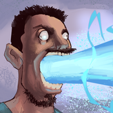
Well it looks good, nice job. Do not worry about liklines too much, when you make a stilised portrait you always lose someting, it is important to keep key features you chose recognisabul enoth. Few thihgs you can do to improve it: You can step out a little from the original photo and move his ears up, just a bit, you could move the shadow on HIS right chek a little up and you could make the bg a little darker to make him pop up slightly more. You can do one of this things or all of them, or whatever you want. Hope it is useful.

3yr
Asked for help
[Update 3] I think i've gotten alot of the "line of site", scale and some overall composition issues solved. Welcome any critiques on the composition, color/lighting, and perspective. Excited to start locking stuff in soon and fleshing out the actual character drawings.
Ignore the sloppy part on the picnic table on the bottom right. As well as the sloppy leg in the same area. Trying not to waste too much time on refining certain things until i get this composition down first.
Avel Ciobanu
3yr
Do not take what I'm saying to close to your heart, it is just a subjective suggestion. But here are few weak spots of your drawing:
From the point of view you chose would be a little hard to show the accurate size relations between characters, like: "are they all of the same size ?" or "Isn't the duck the smallest?" It might be disturbing for the viewer.
Now, about the actual composition, I think it doesn't tell as much of a story as it might. As i understand these characters are ment to have a nice barbeque time. You might try to show that by making them interact more with each other, may be have a lovely chatting around the barbeque and even put some extra characters to better convey the mood.
And also you may indicate which objects are closer to the viewer by applying atmospheric perspective to the scene. Even on this stage it would help a lot, if you will chose where are yours foreground, middleground and background.
By the way you are doing good, do not give up, keep drawing.
Ps: English is my second language.
Аа
Show all replies (1)
Show 1 more replies