


Drewster H
added comment inHow to Draw the Head from Any Angle
2yr
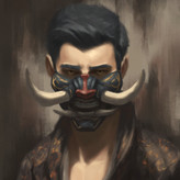
Just started this course yesterday and I'm so excited! The loomis method is so hard for me wrap my head around, I feel like I'm failing to comprehend exactly how the small oval on the cranium looks at different angles. The cross inside has been a lot more difficult than I thought it would be.
The jaw is also fascinatingly frustrating. It doesn't look straight at all, especially when the head it tilted upwards and at an angle (you can see on the left side of the first picture where I struggled with that exact pose). When I try to track a straight line from the far end, it lines up, but it feels so crooked, even in the reference model. Maybe that's why I struggle so much with it.
Anyway, I would appreciate any feedback anyone has. I really like these, and that means it's time for a heaping slice of that sweet, sweet humble pie. So don't spare my feelings and rip them to shreds please!
Show all replies (1)
3yr
Wow this is really great. I love watching the idea develop like it did
Show all replies (1)
3yr
These are really neat, I especially like the first one, it feels like it would be like a cosmic being, the lighter bits would be glowing and the darker would be pitch black
Show all replies (1)

Hi @Drewster H, I appreciate that you took the time to tackle a full blown illustration like this. In my experience, doing longer paintings that are outside of your zone of experience helps to exaggerate your weak points, which makes them easier to address in the future.
I attached an image where I used curves and a posterize layer on photoshop to do a rough value simplification of your artwork. When we look at the graphic design of your piece through limited values, we can see that you currently have a bit of a design motif going on where there's repeated vertical lines, made visible through your light values. Because there's so much repetition of this design motif, but nothing to counter balance it, the composition feels a bit weaker. You had a concern about the wings, and I think the gesture of the wings can bring a great graphic design element to the piece. I attached a painting by Tyler Jacobson, where he uses the wings as big graphic curving shapes. This adds variety to the composition, and it helps to frame the character's body.
Additionally, I attached another piece of fantasy art by Chase Stone, simplified into rough graphic shapes. Chase happens to be a hybrid 3-D and 2-D digital artist, which means he is capable of rendering out his scenes to get near perfect light on his materials. Notice how simple his composition though. Even though he probably rendered his character so that it has perfect reflections on his armor, he uses his skills as a 2-D composer to pull back the unnecessary information to black. He leaves the lighting information mostly for the face and some parts of the background, because the focus of his piece is in the character's face. The main takeaway is: you don't have to paint all the materials in your scene to be perfect. In fact, sometimes this will cause distractions in your piece and take away from the focal point. It might be easier for you to compose in this 3 value stage and make sure the image is working the way you want it to first, before moving on to the harder bits like color.
Hope this helps! Let me know if there is something that you would like me to address further, or if you have any more questions!
Drewster H
3yr
Thank you so much Luigi! I'm grateful you invited me to ask more questions because I have plenty for you @_@.
I've done a little study on composition but it's one of those topics that flies right over my head. Your posterized images were pretty eye-opening. In my original image, I put the light on his lower torso with the goal of having his face caught in a reflected light or glow coming from the rest of his body, but I can see that it really doesn't stand out against the bright shine of the armor's trim. I had a bit of an idea of this last night thanks to Dan's critique and fiddled with it a little, but I posterized the result like you showed me and I don't think I solved the problem yet. I'll post the newer version and it's posterized sibling for you to see. I'm in dangerous territory now and I'm not sure how I want to continue, I think if I really tone down the light on the armor but leave the two vertical strips of cloth illuminated to guide the eyes down to his sword (or up to his face FROM the sword) it might be the fix I need, what do you think?
I really like the images you shared of those other artists, Tyler's wings are really impressive and Chase's lighting focus is definitely the effect I wanted. I think I need more space to define a gesture with my wings like Tyler did, do you think It would be wise for me to either scale down my character and re-position him or scale up the canvas? Dan also mentioned that the wings may be a serious hinderance to the composition as they are.
I have no hesitation butchering the piece (I'll save backups) so don't worry about suggesting something extreme. Thanks again so much for your help!
Show all replies (9)

Welcome :)
Good concept you have there. The thing that first stood out to me is the image leads my eyes around all over the place before finally finding the face. I'd work to accentuate the area you most want focus on and lead to that.
For example, the sword is a very bright and contrasting colour. Is it important to the character? I'd desaturate it a bit but keep the strong metallic look.
You've done a great job with the metallic look on the outfit, but it does take focus away from the face with how bright it is so again I'd desaturate it to see how that brings out the face more. Maybe ditch the wings and see what that looks like, otherwise, just grab some references and photobash if you have to to figure it out :)
From what I see it looks like he's just walked into the sunlight and is not at all happy about it? I think lighting-wise, if it's bright light it needs to create harder edged shadows. See for instance the attached pic, notice the contrast and hard edges (face, clothes).
I'm new at this critique business and by no means a pro so hopefully I'm providing some good suggestions :)
3yr
Thank you so much!
There was a point in which I had some clear light on his lower torso, but it looks like I lost track of that in rendering. Ill definitely take your advice and try to fix the focus. Your totally right about that sword, I want it to be the secondary focus next to the face, but I think its too saturated now that you bring it to mind, Ill play with that. ill definitely use that reference you sent me too and see if I can find some more that will help me.
added a new topic
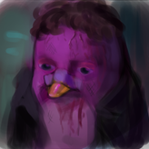
I started something I don't know how to finish3yr
Hey Guys!
This is my first time posting work here on Proko.
I’m a little nervous But don’t let that stop you from tearing me up. Here is a WIP I’m working on , I tried to plan out the lighting but I skimped on composition which may have cost me but I’ve failed to see how exactly. I’m really struggling with shadow, light, and texture. So, I would really appreciate any tips you might have, or any mistakes you spot. With your help I might be able to bring this piece up to a professional level so please show no mercy. Even if I fail and make it worse, you’ll save me a ton of time and effort next time.
You can think of the character as a vampire. Those two large masses on the left and right are the edges of large bat-like wings, the left wing has those bladed metal plates. I’m having a real problem making all that clear. I’m also not sure how to use those wings to improve the composition.
All feedback is welcome,
Thanks!
Hello! I'd love to download this video (I live in the country so I download what I can while I'm in the city) But there's no option to. Would love some help, but no rush, I'm still on deltoids so I won't need this for awhile.
Show all replies (1)

Asked for help
Hey team, first I just wanted to say this lesson is AWESOME, I've been struggling with hands for a while and finally buckled down for a week to really zero in on them. Day one is the awful blocky boi, and you can see such improvement after just a couple days of handiwork. Are they perfect? Nah, the perspective needs work on a few boxes, especially in those "four shortened" sticks. Also, how do you guys illustrate where the phalanges meet the metacarpals? The sliding boxes just aren't clicking for me.
No pressure @Liandro , but since you've been the most insightful, warm, and helpful critic in the history of this beta site, I'd love your thoughts!
PS: This was done DIGITAL-ly. Hahaha.
3yr
These look really great! Did that thumb in the last one throw you off as much as it did me? It's amazingly confusing for such a simple pose. The meeting at the metacarpals is something I'm. Struggling with too, sorry I cannot be of any help there :\ ill keep and eye on your post for the coming answers
Show 2 more replies

3yr
Asked for help
Wanted to spice things up and make sure I maintained the volumes by animating a short turn. Done in procreate.
Show 14 more replies


3yr
Asked for help
Hi. I only started recently and I'm struggling to do the extreme angles. Also struggling to draw a perfect circle too haha.
3yr
The struggle is real :0 I'm not so successful at heads myself, but I did notice they got a bit easier as I studied more 3D forms, namely cylinders. Perhaps you should draw a cylinder, draw a line dividing it in half, then practice spinning it at any angle and keeping the line proportionate? I dunno...actually, I oughta try that myself, I never even tried my own suggestion!?
One thing I actually DID practice is drawing squares at all angles and practice putting a perfect circle that fits inside it. Using the squares as a guide helps me draw circles in perspective, which translates well with head drawing
Show 3 more replies

3yr
Asked for help
Heres some 30 sec and 1 min gesture drawing, all feedback very welcome
3yr
It looks like you and I have a similar weakness. I tend to think that a gesture is something that has to be constructed quickly, which unfortunately makes my lines a little sloppy and off place. Some of these look like you might have fallen into the same trap. I notice when Stan does his gestures, he practices the stroke a couple of times by hovering the pencil over the paper a couple of times before putting it down and making a mark. Perhaps we should try the same thing.
Over all I think you have some really good gestures here, I don't think I could do better at my current level. Thank you for posting! I am encouraged by your work
Show all replies (1)
Show 5 more replies

3yr
Asked for help
Hello! I tried to draw the gesture design, not the details.
Can you see it from these?
And what should I be more conscious of to improve my drawing?
I’m eager to hear your comments and critiques😊
3yr
I really admire your use of carefully chosen and clean lines. Gesture is very hard but you seem like you're certainly getting it right. I'm sorry that I don't have much in the way of useful critique, you're further along than me in gestures so I had to work hard just to find anything that I think you might be able to improve on.
What I found may or may not be a problem for you, but I think you would benefit from adding more gesture to some of your feet. You used gesture in the more dynamic poses.but in the simpler ones you used a plain triangle, which is probably fine since that's not what you were studying in those specific poses but I would enjoy seeing how you could turn a "boring" foot position into something more interesting using more of your gesture skill.
Show all replies (3)
Show 17 more replies